I start by scaling art to fill two-thirds of my wall’s width. For my sofa, I choose a piece spanning most of its width and hang it six inches above. Gallery walls come alive with floor-planned layouts and mixed textures. I use vertical triptychs for narrow walls or a single bold canvas for short ones. Mirrors add light and dimension. There’s a perfect approach for every space, and I can show you how to find yours.
The Golden Rule for Scaling Wall Art
While you might think bigger is better, I find the golden rule for scaling wall art is about proportion, not just size.
I measure my wall and the furniture it relates to. For a single piece, I aim for it to fill about two-thirds of that wall’s width. It creates balance without overwhelming the space.
This simple math saves me from buying art that’s always too small or comically large.
Considering different living room styles can also influence how you choose and scale your wall art to complement the overall decor.
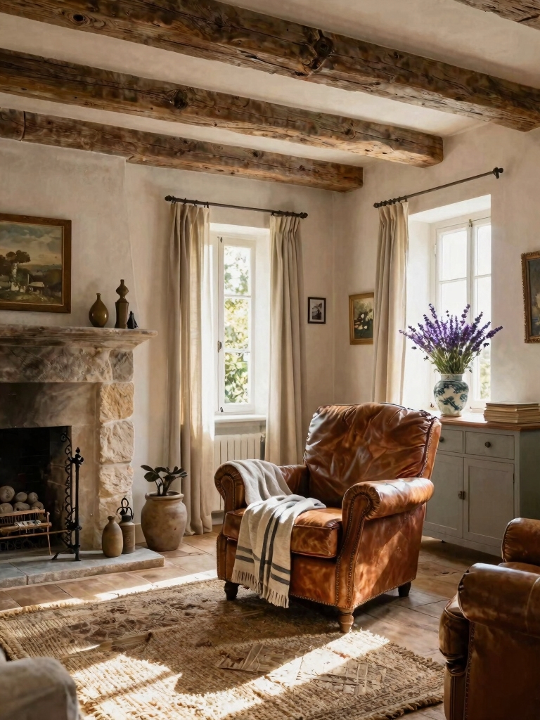
How to Perfectly Size Art Above Your Sofa
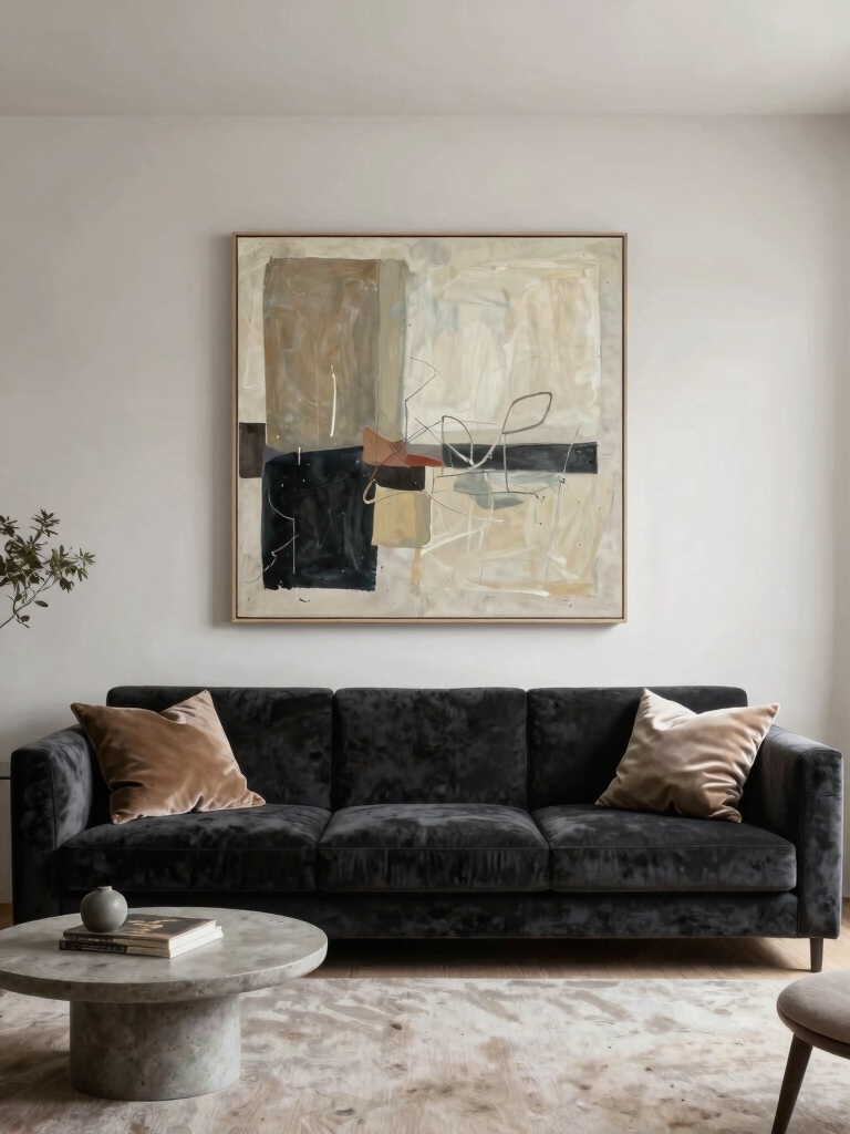
Three key measurements solve the puzzle of sizing art above your sofa.
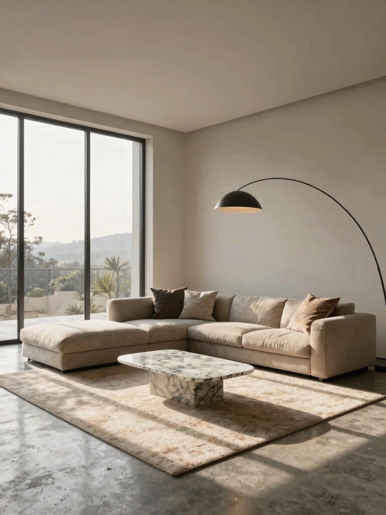
I first measure the sofa’s width. My art should span two-thirds to three-fourths of that length.
Then, I check the space from the top of the sofa back to the ceiling. I’ll hang the piece’s bottom about six to eight inches above the back.
This simple math creates a balanced, cohesive look every time.
Incorporating creative decor ideas can further enhance the overall ambiance of your living room.
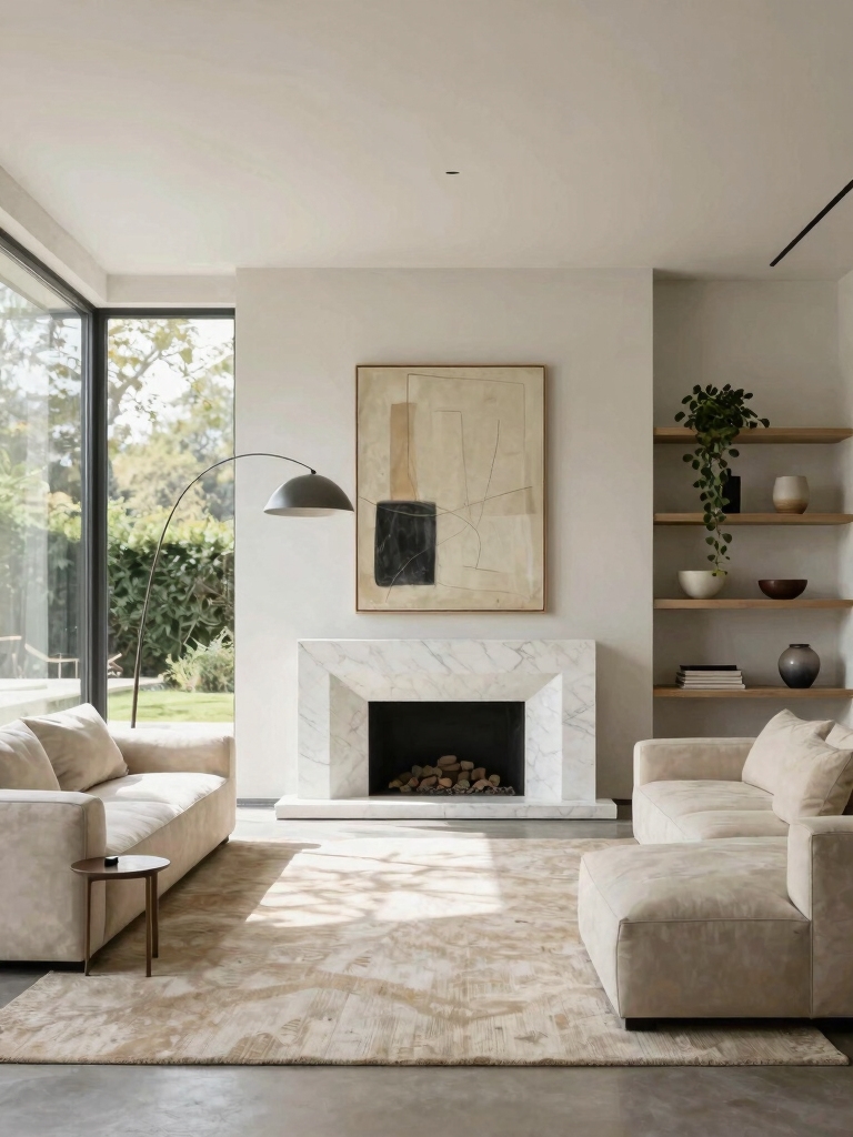
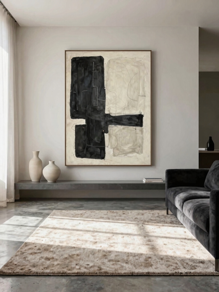
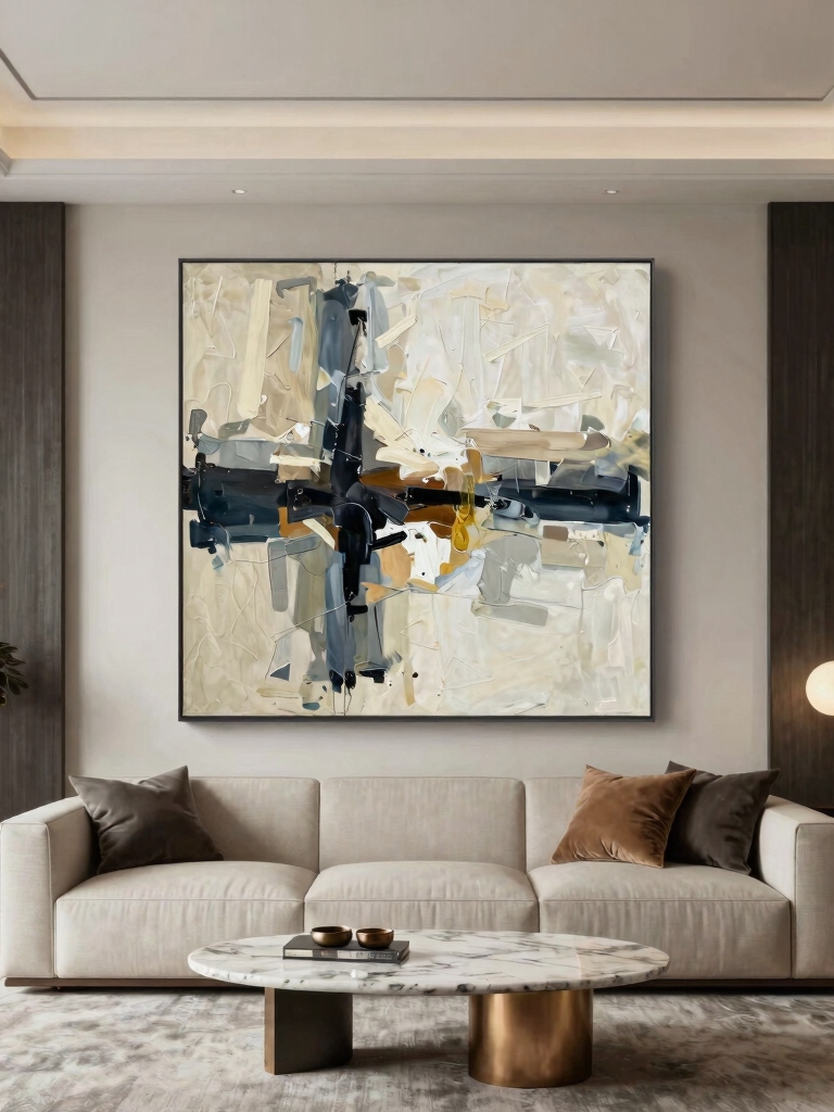
Make a Statement With an Oversized Canvas
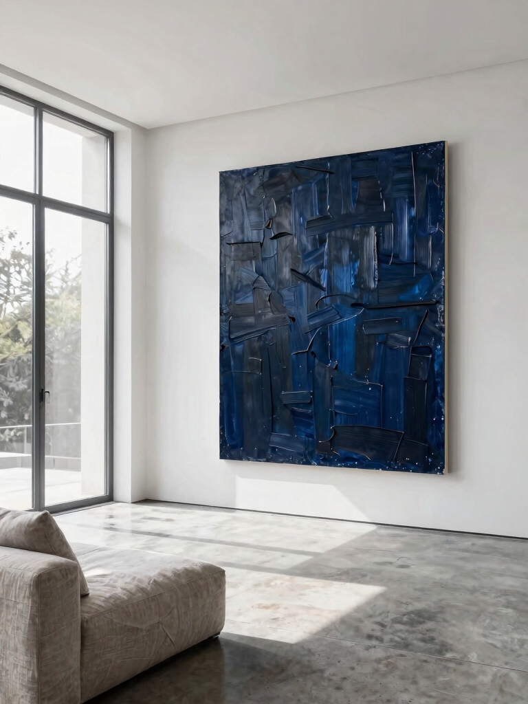
Because I want a bold focal point, I choose an oversized canvas. It instantly anchors my room.
I don’t need a complex gallery wall—just one powerful piece. For a DIY-friendly, economical approach, I consider these points:
- Use a large, pre-primed canvas
- Try abstract shapes with painter’s tape
- Work with a simple, limited color palette
- Stretch a favorite fabric over a frame
- Hang it securely with a cleat system
Adding aesthetic decor like an oversized canvas can truly transform your space and elevate the overall mood of your room.
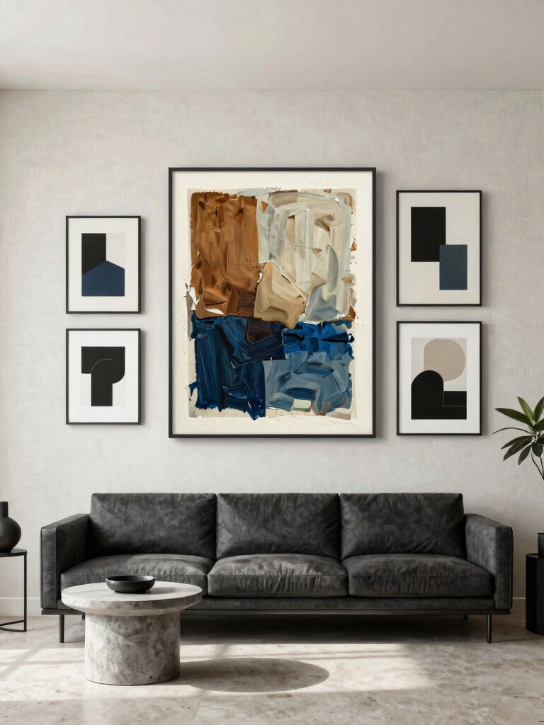
Designing a Gallery Wall for a Large Blank Space
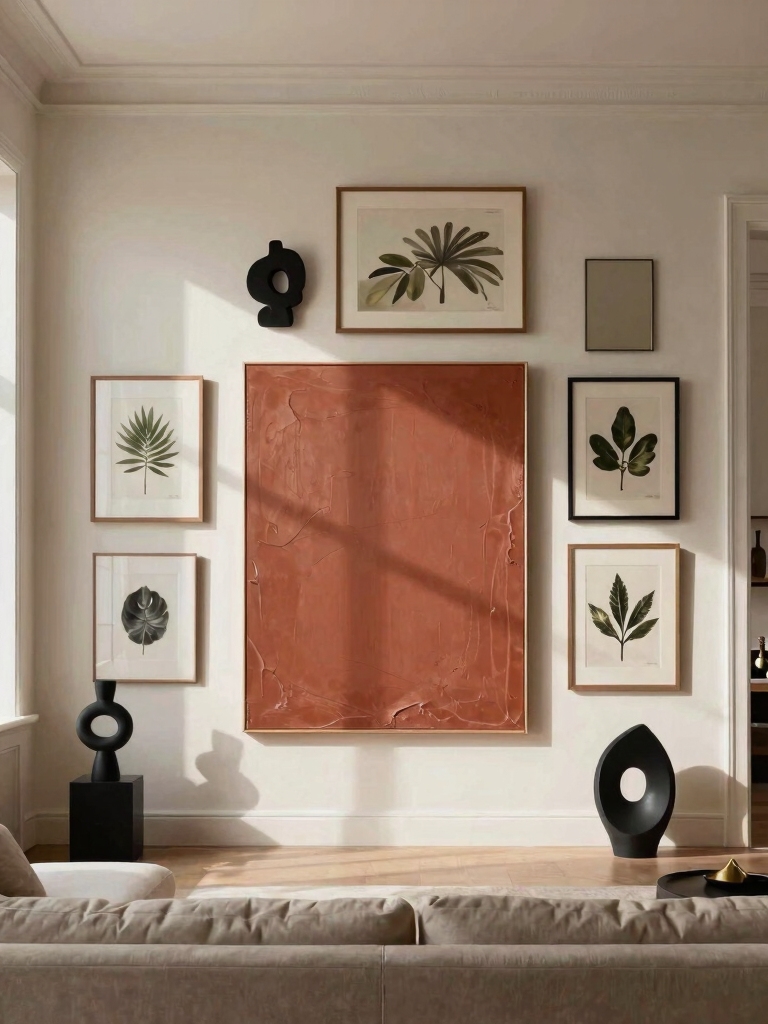
A gallery wall solves my large blank space by turning emptiness into a curated collection.
I start by arranging frames on the floor to find a balanced layout. Then, I use paper templates to mark positions before hanging.
Mixing small prints with personal photos keeps it affordable. I focus on cohesion by repeating a color or theme.
This DIY approach creates a dynamic focal point without a major investment. Top designers often recommend layering different textures and styles to enhance wall decor impact.
Filling a Tall, Narrow Wall With a Vertical Triptych
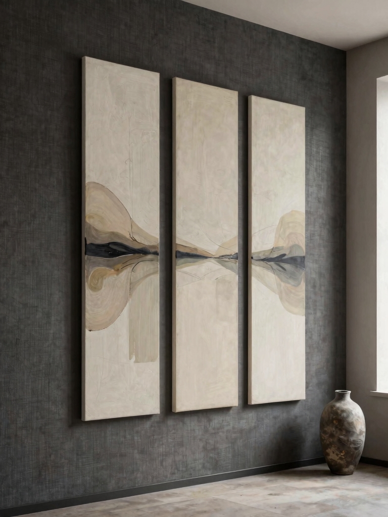
Tall, narrow walls need a specific solution, and I’ve found a vertical triptych works perfectly.
I always start by choosing artwork that leads the eye upward through color or theme.
Then, I hang the pieces in a tight, single-column line to maximize the wall’s height.
Incorporating a wall mirror can also enhance the sense of space and light in the room.
Choosing The Right Artwork
How do you fill that tall, narrow wall? A vertical triptych is my perfect solution.
Choosing the right artwork means focusing on three coordinated pieces that work together in a slender column.
- Select a cohesive theme, like a landscape split into three panels.
- Use a consistent color palette across all pieces.
- Opt for simple, unframed canvases for a modern look.
- Guarantee each panel has a strong vertical element.
- Maintain equal spacing between them for balance.
Vertical Arrangement Strategies
While you’ve chosen the art, arranging it requires careful placement.
I find a vertical triptych ideal for tall, narrow walls. Hang the pieces closely, in a tight vertical column. This draws the eye upward, emphasizing height.
I keep spacing uniform—often just three inches between frames. It’s a simple, diy-friendly strategy that transforms an awkward wall into a deliberate, elegant focal point without clutter.
What’s the Right Size for Art Above a Console?
Because the console anchors the space, your artwork should relate directly to its width. Aim for a piece roughly two-thirds to three-quarters of the furniture’s width for balance.
I keep these rules in mind:
- Measure first: Size the art to your console.
- Mind the gap: Leave 4-8 inches between them.
- Center it: Align the artwork over the console.
- Go big: One large piece often works best.
- Try a trio: Three smaller works can create a unified line.
For beginners, starting with simple and easy living room decor ideas can make the process less overwhelming and more enjoyable, especially when selecting wall art sizes.
How to Choose Art for a Wide, Short Wall
I’ll often use a single, wide horizontal piece as a focal point.
You can also create a gallery wall of smaller works that stretches across the space.
Mirrors or metal art add a sleek accent that helps balance the proportions.
Using wallpaper on an accent wall can add texture and style, making it a standout feature in your living room with stylish wallpaper ideas.
Horizontal Artwork Focal Points
Choosing the right horizontal artwork for a wide, short wall lets you stretch the space visually. I focus on a single, strong piece to act as an anchor.
My tips are:
- Select a landscape or panoramic photograph.
- Use a wide, low-profile canvas.
- Opt for a piece with extending horizontal lines.
- Frame it simply to avoid bulk.
- Center it just above eye level.
Gallery Wall Groupings
If a single large horizontal piece doesn’t fit your vision, creating a gallery wall can be the perfect diy solution for a wide, short wall.
I use mixed sizes but keep the overall arrangement low and wide. I lay my frames on the floor first to find a balanced composition.
This spreads visual weight across the wall without needing one expensive, oversized piece. It’s my favorite budget-friendly method.
Mirrors And Metal Accents
While gallery walls often rely on framed prints, mirrors and metal accents can also anchor a wide, short space with their reflective and textural qualities.
I use them to add light and dimension. Consider these ideas:
- Hang a long, horizontal sunburst mirror.
- Install a series of small, circular metal discs.
- Lean a large, ornate floor mirror.
- Group geometric metal wall sculptures.
- Use a polished steel tray as art.
Hanging a Single Bold Piece in a Small Nook
Even a small, underused corner can become a focal point when I hang one bold, oversized piece of art.
It’s a minimalist trick. I choose something with strong color or a graphic pattern. A single nail and careful hanging makes it work.
This simple statement piece instantly anchors the nook, giving it purpose without clutter.
I’m often surprised by the impact this one-item solution provides.
Pairing the artwork with stylish coffee table decor can further enhance the living room’s overall aesthetic.
Creating a Casual Look With a Leaned Wall Art Gallery
Moving beyond a single statement, I sometimes lean into a more relaxed aesthetic with a gallery of art arranged casually against the wall. This method feels spontaneous and lets me change pieces easily.
- Prop frames on a low shelf or mantel.
- Layer smaller pieces in front of larger ones.
- Mix artwork with objects like a small vase.
- Use varying frame styles and art mediums.
- Let pieces rest on the floor for height.
Incorporating inspiring wall decor ideas can add a fresh and personal touch to your living room couch area.
Using a Picture Ledge for Flexible Art Arrangements
I love my picture ledge because I can swap art for the seasons without any fuss.
I mix frames and canvases on it to keep things fresh. I also adjust each piece’s height until the arrangement feels just right.
This simple addition can transform your walls instantly, making any space feel more inviting.
Effortless Seasonal Swaps
To keep your living room’s energy fresh throughout the year, consider using a picture ledge for flexible art arrangements. I swap pieces in minutes without tools or new holes.
- Rotate prints for spring florals or autumn leaves.
- Lean small canvases against the wall.
- Prop up found objects like interesting driftwood.
- Exchange framed photos seasonally.
- Layer in holiday cards during festive months.
It’s my favorite minimalist update.
Varied Artwork Combinations
Beyond seasonal swaps, the picture ledge lets me mix different types of art together for a personal display.
I can layer small prints, a sculptural piece, and a large painting on one shelf. It creates a dynamic, collected look without costly framing or permanent holes.
I simply adjust the spacing and order until it feels right. This layered approach is my favorite for showcasing a diverse artistic taste.
Personalized Height Adjustments
Because a picture ledge removes the commitment of single-height hanging, I can personalize each piece’s position.
I lean frames for a layered look and adjust them anytime. It’s perfect for my evolving gallery.
- Shift art for seasonal refreshes.
- Mix frame sizes without new holes.
- Display books or small objects.
- Experiment with vertical spacing.
- Hide hanging hardware completely.
Making a Big Impact With a Grouped Art Collection
While individual pieces have merit, a grouped art collection transforms a wall into a cohesive focal point.
I cluster similar frames or themes for impact. I start by laying pieces on the floor to arrange them. I favor uniform spacing for a clean grid or varied gaps for a relaxed salon hang.
This method turns separate artworks into one powerful statement, maximizing my wall’s visual potential without overspending.
Going Floor-to-Ceiling With a Cohesive Art Grid
If you’re ready to take that grid concept further, a floor-to-ceiling art installation can command an entire wall.
I find sticking to a cohesive theme creates a dramatic focal point.
Try this:
- Choose one style, like all black frames or botanical prints.
- Measure your wall and plan the grid layout first.
- Use consistent spacing between every piece.
- Start hanging from the center out.
- Mix sizes for visual interest within the unified grid.
Should Your Wall Art Match Your Rug or Pillows?
Should you deliberately match your art to your rug or pillows? I don’t think you need a perfect match. A deliberate match can feel overly styled.
Instead, I look for a loose connection. Maybe I pick up one color from my rug’s pattern or echo a texture from a pillow. This creates a cohesive feel without being too matchy.
It’s more interesting and feels collected over time.
Using a Mirror as Stunning Wall Art
I’ll explore three key things to get right when using a mirror as your main wall art.
It starts with choosing the right shape and frame, then finding the perfect placement for it.
Finally, I’ll show you how to style the furniture and decor around it.
Choosing The Right Mirror
One simple yet stunning wall art idea transforms any living room: using a mirror as a focal point.
I choose the right one by focusing on these details.
- Consider scale: It should balance the wall’s size.
- Pick a frame: Choose wood, metal, or a thrifted find.
- Love the shape: Circles soften; rectangles add structure.
- Think reflection: What lovely view will it double?
- Check quality: Confirm the glass is clear and secure.
Placement For Maximum Impact
Once you’ve chosen the ideal mirror, its placement makes all the difference. I hang it where it’ll reflect the best light or a key view, not a blank wall.
I consider it a major art piece, so I center it on a primary wall or above a sofa. Getting the height right is essential; the center should be at eye level for the most powerful visual impact.
Styling Around Your Mirror
With your mirror positioned, think of it as your art’s anchor point. I build my arrangement around it, creating balance.
Here’s my approach:
- Flank it with smaller framed prints or photos.
- Layer a floating shelf below for small objects.
- Add a single, bold piece above for a vertical line.
- Use sconces on either side to frame it with light.
- Lean a large canvas against the wall beside it.
Layering Art and Objects on a Shelving Unit
Think of a shelving unit as your curated gallery. I start by leaning framed art against the back wall.
Then, I layer smaller objects like books or a ceramic vase in front. I vary heights and textures for visual interest.
It’s an easy, forgiving way to display favorite pieces. You can always rearrange them later without putting holes in your wall.
Pro Tips for Hanging Art at the Perfect Height
Shifting to pieces you want to hang, a common challenge is getting the height right. I aim for the center of the artwork to be at my eye level. This creates a natural focal point in the room.
Remember, it’s easier to adjust than to stare at an awkward placement every day.
- Measure 57 inches from the floor; that’s your standard center point.
- Hang pieces together as one unit.
- In dining rooms, lower art for seated viewing.
- Use two hooks for stability.
- Check your work with a laser level.
Conclusion
Now you possess the golden rule. Consider these ideas a gentle nudge to fill those empty walls. Remember, there are no true mistakes here—only opportunities to refine your space. Trust your eye, measure twice, and begin. Your blank walls are simply canvases awaiting your hand.