First, I decide what mood I want my dining room to evoke. For warmth, I choose creamy neutrals like Swiss Coffee or earthy terracotta. If I crave drama, a deep emerald green or charcoal gray makes a bold statement. For serenity, I lean into soft blues or cool greiges. My final tip? Let’s explore how lighting and accent colors bring these ideas to life.
How to Choose a Dining Room Paint Color
Have you ever stood with a paint sample in hand, wondering if it will truly transform your dining space?
I start by considering the room’s light and my home’s flow. Your dining room’s purpose is key; I ask if it’s for vibrant dinners or serene meals.
I always test large swatches on different walls. Remember, the right color doesn’t just cover walls—it shapes every conversation and meal shared there.
In small spaces, using decor tips to transform the room can make your dining area feel more inviting and spacious.
Cozy and Inviting: Warm Neutral Paint Colors
While the previous tips help you choose, let’s explore the specific palette that creates a welcoming atmosphere.
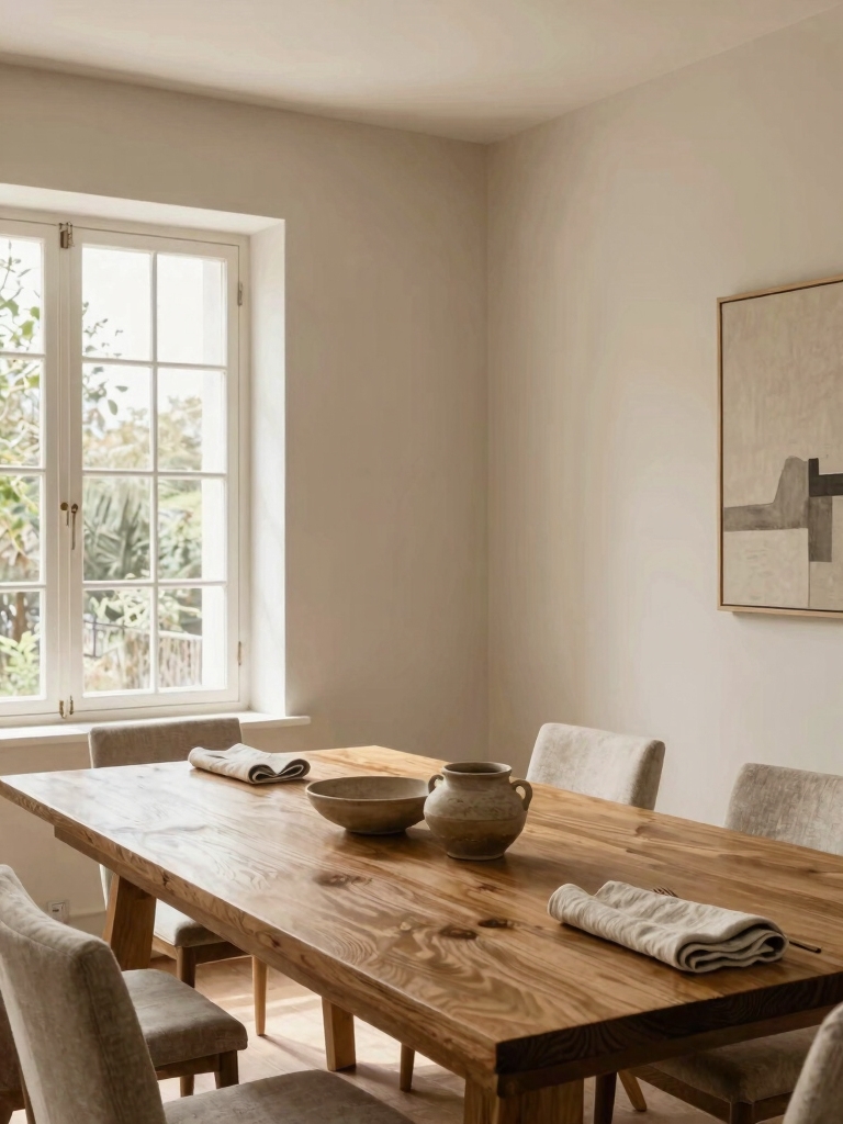
I love warm neutrals for their timeless ability to make a room feel like a hug. They provide a serene backdrop that lets your dining experience and decor truly shine.
- Creamy Whites: Think Swiss Coffee or Alabaster for soft, luminous warmth.
- Taupe & Greige: Balanced tones that are cozy without being too cool.
- Warm Beige: A rich, earthy base that feels inherently comforting.
For an added layer of comfort, consider incorporating cozy living room decor ideas that emphasize warmth and texture to complement your paint choices.
Bold and Dramatic: Deep Color Statements
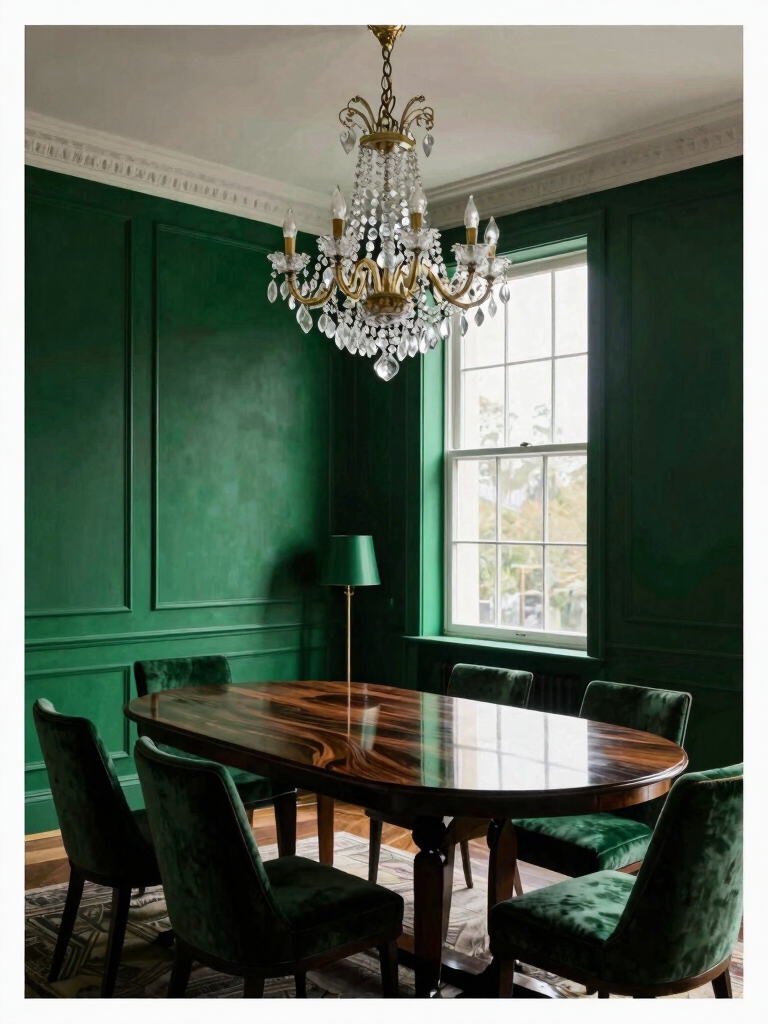
For those ready to make a powerful impression, deep paint colors transform a dining room into an unforgettable space.
I’d choose a rich navy or a velvety charcoal for walls to create instant drama.
Pair them with crisp white trim and metallic accents for balance.
These shades command attention and make every meal feel like a special event, proving your dining room’s style is as deliberate as the menu.
Adding stunning wall decor ideas can elevate the atmosphere and truly transform your dining room.
Serene and Airy: Light and Cool Paint Colors
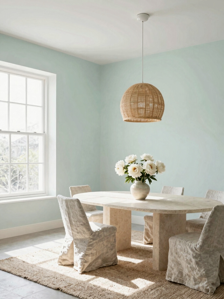
If you’re craving a sense of calm, light and cool paint colors will make your dining room feel serene and airy.
I love how they expand the space and invite a peaceful atmosphere perfect for long conversations.
For a truly contemporary feel, consider these inspiring choices.
- A soft, misty blue that mimics a clear sky.
- A gentle, grayish-green reminiscent of sea glass.
- A crisp, pale gray with subtle blue undertones.
Incorporating these shades can help you create a cozy living room ambiance that embraces warmth while maintaining a fresh look.
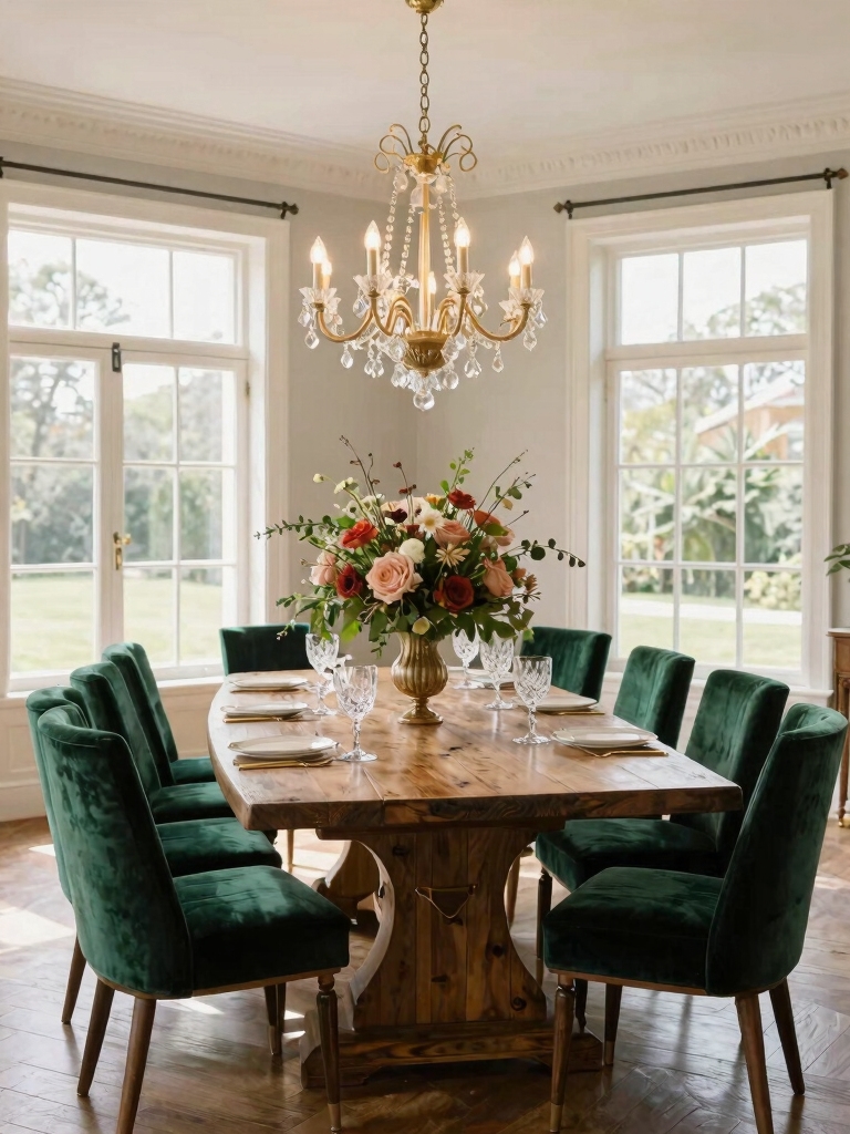
Earthy and Organic: Natural Tone Paint Colors
To bring a grounded and welcoming energy to your space, I’m drawn to earthy and organic paint colors for their timeless, natural feel.
Think warm taupes, soft terracottas, and muted browns. These hues connect your dining room to the outdoors, creating an instantly comforting atmosphere.
They’re wonderfully versatile, pairing beautifully with wood tones and natural textures for a look that’s both sophisticated and effortlessly relaxed.
Incorporating earthy textures into your decor can further enhance this natural living room aesthetic, adding depth and warmth to the overall design.
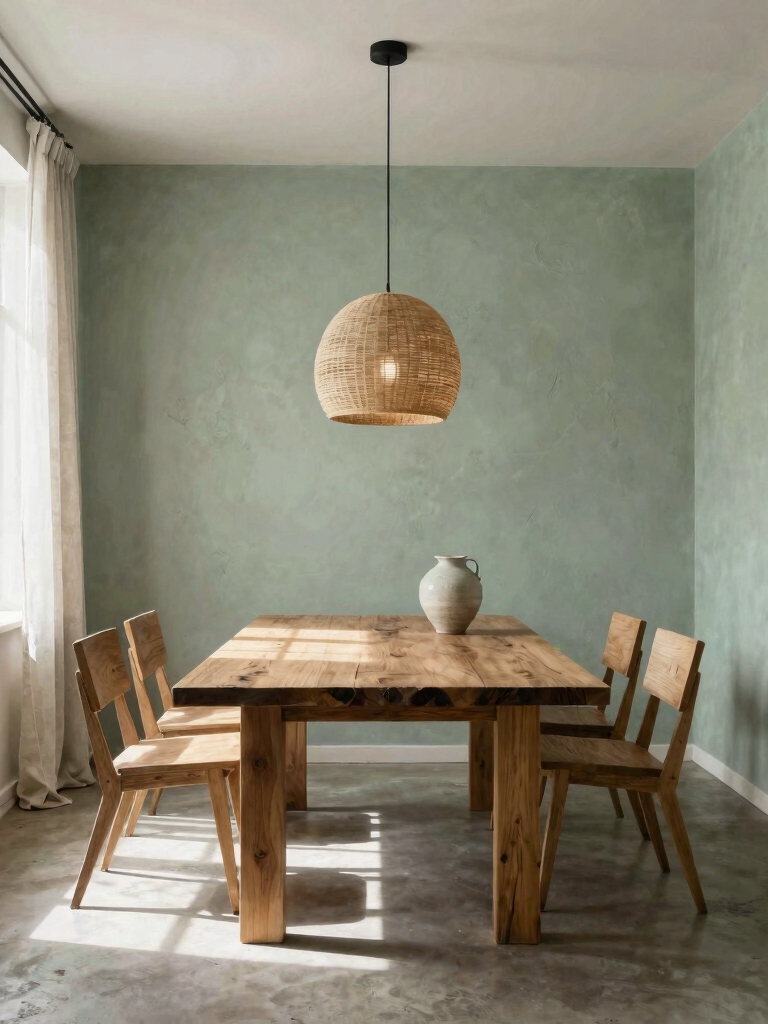
Sage Green: A Calming Dining Room Hue
I love how sage green creates a harmonious color palette that feels both fresh and timeless.
It instantly evokes a natural ambiance that makes shared meals feel more grounded and connected.
This versatile shade works perfectly for various styles, from modern minimalist to rustic farmhouse, giving you a serene backdrop that complements your favorite decor.
For small spaces, sage green can be paired with charming dining room ideas to add style without crowding the room.
A Harmonious Color Palette
While many colors energize a space, sage green offers a uniquely calming foundation for your dining room.
I love how it acts as a sophisticated neutral, letting you build a layered, harmonious palette. Pair it with these hues for a contemporary look that’s both cohesive and inviting.
- Crisp White for architectural trim and ceilings.
- Warm Wood Tones in furniture and flooring.
- Dusty Pink or Navy accents for depth and character.
Evoking A Natural Ambiance
Beyond those harmonious pairings, this color’s real power lies in its ability to connect your dining space directly to the outdoors.
I find it instantly brings in a serene, natural light. It’s perfect for softening hard edges and makes a room feel more grounded.
For a truly immersive effect, I pair it with natural wood furniture and unbleached linen textiles. You’ll create a calming, organic sanctuary.
Perfect For Various Styles
Sage green’s adaptability makes it a fantastic choice for nearly any dining room aesthetic.
I love how it instantly refreshes a space. You can lean into its versatility with your decor choices to craft a completely unique feel.
- Modern Farmhouse: Pair it with shiplap and rustic wood.
- Mid-Century Glam: Add sleek lines and metallic accents.
- Coastal Retreat: Combine it with woven textures and crisp white.
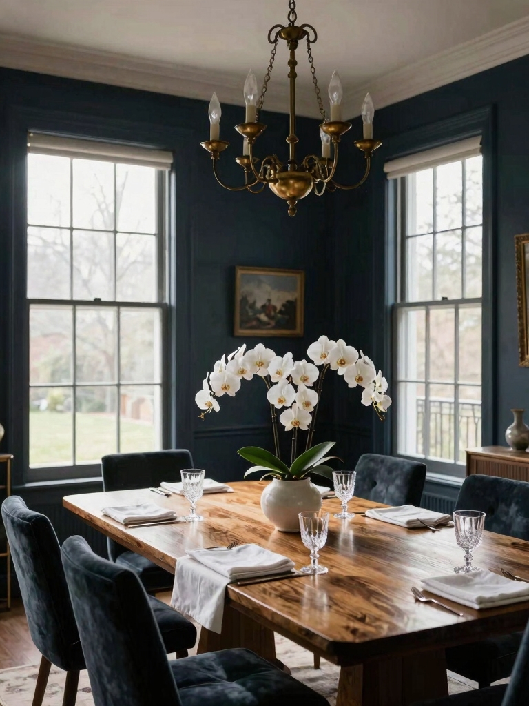
Navy Blue: Classic Drama for Dining Walls
I’m drawn to navy for the instant drama it creates, making my dining room feel intimate and focused.
When I pick this color, I choose a shade with just enough warmth to keep it inviting as the evening light fades.
Balancing it with crisp white trim and warm wood furniture is what makes the whole room sparkle.
To maximize the effect in a smaller space, consider open layouts that blend your dining area seamlessly with the living room, enhancing the sense of space and flow.
Color Selection Guide
Navy blue delivers a dramatic and sophisticated foundation for your dining room walls.
I find it’s essential to choose the right shade for your space and lighting to set the perfect mood.
- Sample liberally—test large swatches on different walls.
- Consider your lighting—both natural and artificial—as it transforms the color.
- Check the undertones to guarantee they complement your fixed elements.
Furniture And Accents
Once you’ve committed to that rich navy hue, balancing it with furniture and accents becomes a key, enjoyable part of the process.
I love how crisp white chairs and a warm wood table pop against it. Add metallic gold hardware or a mirror for modern drama.
Keep textiles light and your art vibrant to maintain balance. It’s about creating a space that feels both sophisticated and welcoming.
Creamy Off-White: Timeless and Versatile
If you’re looking for a foundational color that works with almost any style, a creamy off-white is your most reliable choice.
I love it because it creates a serene, luminous backdrop that lets your furniture and art truly shine. It’s endlessly adaptable.
- Brightens naturally darker rooms without feeling stark or sterile.
- Acts as a perfect neutral canvas for bold accent colors or rich wood tones.
- Feels inherently warm and inviting, elevating every meal.
This color also helps in creating a harmonious flow between your dining room and adjacent spaces like the living room and kitchen, enhancing overall home decor cohesion.
Terracotta and Clay: Warm, Earthy Energy
While a creamy off-white offers timeless versatility, stepping into the warm spectrum of terracotta or clay can inject a dining room with earthy energy and grounded comfort.
I love how these pigments instantly feel cozy and inviting. They pair beautifully with natural wood and woven textures.
For a contemporary twist, I’d balance the richness with crisp white trim and modern black accents in my lighting and furniture.
This approach captures the essence of timeless modern dining room inspiration, blending classic warmth with sleek, current design elements.
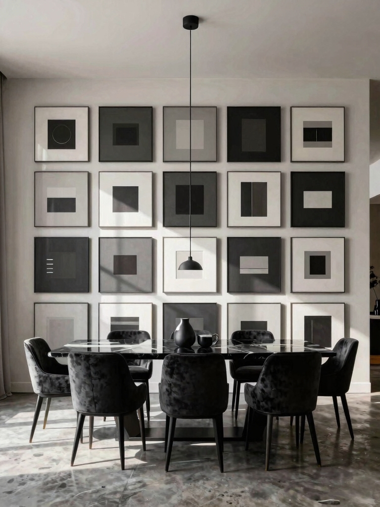
Charcoal Gray: Modern Dining Room Sophistication
Moving from warm earth tones to the depth of charcoal gray introduces a distinctly modern and sophisticated edge to a dining space.
I find it creates an elegant backdrop that grounds the room and makes everything else—your art, furniture, and lighting—pop. It’s surprisingly versatile and feels intentional.
- Creates a dramatic, enveloping atmosphere perfect for intimate dinners.
- Acts as a neutral foundation for metallic accents and bold artwork.
- Provides a sleek, urban contrast to natural wood textures.
Incorporating large living room wall decor ideas can similarly transform your dining area by adding visual interest and personality to otherwise blank walls, enhancing the overall ambiance with stunning decor ideas.
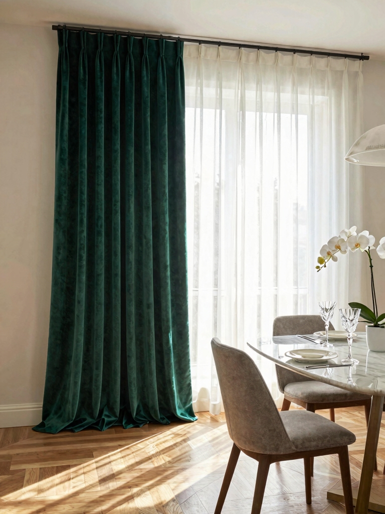
Dining Room Drama With Jewel Tones
I love how jewel tones instantly create a dramatic, unforgettable atmosphere.
Let’s explore deep emerald for sophistication, a sapphire blue for rich ambiance, and rich amethyst for bold accents.
These luxurious colors can truly transform your dining space into something spectacular.
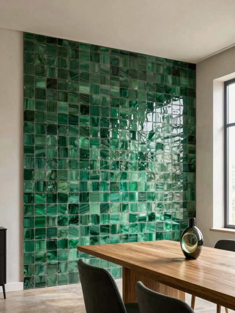
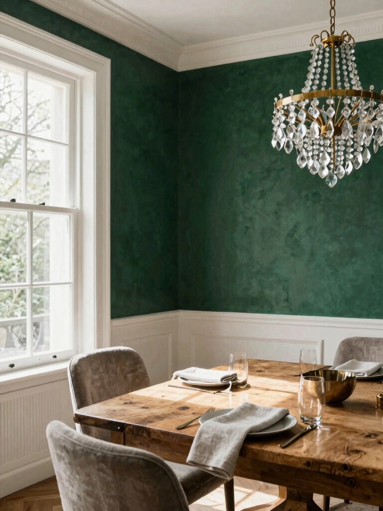
Deep Emerald Sophistication
To create a dining room that truly captivates, consider enveloping the space in a deep emerald green. I find this color brings an immediate, luxurious gravity to meals, turning everyday dining into an event.
It’s a practical choice too—its richness conceals imperfections and pairs effortlessly with both modern metallics and warm, natural woods.
- Instant Ambiance: The color itself creates a moody, intimate atmosphere.
- Versatile Foundation: It anchors bold art or allows for subtle, tonal decor.
- Timeless Drama: You achieve a look that’s both contemporary and enduringly elegant.
Sapphire Blue Ambiance
For a dining space with depth and theatrical energy, sapphire blue offers a bolder, cooler alternative to emerald’s forested warmth.
I love how it instantly transforms a room into a sophisticated, enveloping jewel box. It pairs beautifully with brass fixtures and crisp white millwork for balance.
Choose a matte finish to absorb light, creating an intimate and dramatic atmosphere perfect for evening gatherings.
Rich Amethyst Accents
Some jewel tones energize a space, while others envelop it; deep amethyst manages both.
I love using it for a dramatic accent wall or on my dining room ceiling—it instantly creates an intimate, regal atmosphere.
Pair it with modern elements to keep the look fresh.
- Try a high-gloss finish on trim for a reflective, luxurious edge.
- Balance it with warm metallics like brass or copper.
- Ground the color with natural wood tones and crisp white.
Soft Blush and Mauve: Subtle Warmth
Several classic paint options introduce subtle warmth, but soft blush and mauve achieve this with a uniquely sophisticated calm.
I find these tones build intimacy without feeling heavy. They’re incredibly versatile; pair them with warm metals, linen textiles, or dark wood for balance.
It’s a choice that whispers rather than shouts, creating a restorative backdrop that makes every meal feel like a considered, gentle occasion.
Black: The Ultimate Bold Dining Room Choice
Black makes the ultimate statement for a dining room, instantly creating a dramatic and sophisticated backdrop.
I always find it’s essential to balance that boldness with practical considerations like ample lighting and reflective surfaces.
When you get it right, the result is an incredibly powerful and enduring space.
Dramatic And Sophisticated
While you might hesitate to contemplate it, embracing black paint in your dining room instantly creates a space of unmatched depth and drama.
I see it not as a void, but as the perfect, sophisticated canvas that makes your decor and guests truly shine. It’s a fearless choice that transforms every dinner into an event.
- Amplify your art by letting it pop against the dark backdrop.
- Enhance intimacy and conversation with its enveloping warmth.
- Showcase statement lighting, making fixtures like a chandelier the undeniable star.
Practical Design Considerations
If you’re leaning toward this bold look, it’s essential to plan for a flawless finish, as black paint unforgivingly reveals every imperfection in your walls.
I’ll counterbalance its depth with metallic accents and consider a matte or chalkboard finish to soften the intensity.
Strategic, layered lighting is non-negotiable; it creates warmth and guarantees your stunning space remains inviting and functional for every gathering.
Sunny Yellow for an Energetic Dining Space
To create an energizing hub for morning coffee or lively dinners, consider painting your dining room a vibrant sunny yellow. It’s like bottling sunshine to instantly lift spirits.
I’d pair it with clean, modern furniture to keep the look fresh, not overwhelming.
- Amplify natural light in north-facing rooms.
- Use eggshell or satin sheens for easy cleaning.
- Anchor with natural wood tones for a grounded feel.
Coordinating Trim, Ceiling, and Wall Colors
Because a great paint color deserves a thoughtful backdrop, coordinating your trim, ceiling, and wall colors is an essential final step.
I often paint my ceiling a lighter shade than my walls to add height. Crisp white trim always frames a space beautifully.
For a more modern, unified feel, try using subtle tonal variations of your main color on all three surfaces. This creates a sophisticated and intentional atmosphere.
Conclusion
I chose a deep forest green and my dining room became a story. Every dinner now feels like an intimate gathering, wrapped in quiet drama. Your color is the final, powerful ingredient. Find the one that speaks to your life—then gather, celebrate, and make memories against a backdrop you love.