I lean on timeless neutrals and soft whites, with nature-inspired hues that adapt as life shifts. Core neutrals ground a space, while greige and taupe keep rooms calm, warm, and flexible. I anchor with navy for depth and use varied textures to add depth without clutter. Good lighting and durable finishes preserve color longevity, and I mix neutrals with just one accent color for balance. Want more tips to lock in your timeless palette? Let’s continue.
Why Timeless Color Works in Any Room
Timeless color endures because it isn’t chasing trends; it simply provides a reliable stage for any room’s purpose.
I use it to anchor furniture, balance light, and invite comfort without shouting. It stays flexible as lives change, textures shift, and moments evolve.
With thoughtful contrast and restraint, it quiets the room while letting personality breathe. Practical, warm, enduring.
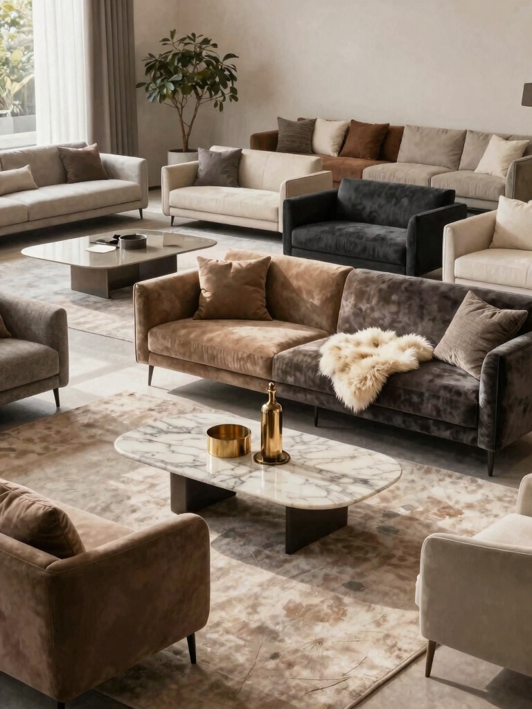
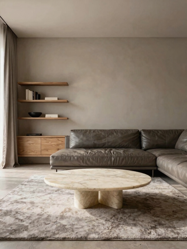
Grey tones, especially in living rooms, are perfect for creating a cozy atmosphere that embraces warmth without overwhelming the space.
Core Neutrals That Ground a Space
Core neutrals ground a space by providing a steady, versatile backdrop that lets our furnishings and textures take center stage.
I celebrate their quiet strength: dependable tones that adapt with seasons and trends. They minimize clash, maximize cohesion, and let natural light breathe.
With practical hints, I’d mix subtle textures and clean lines for timeless warmth and effortless sophistication.
In small rooms, these neutrals can be especially effective, helping to transform small spaces into airy retreats by enhancing the sense of openness.
Soft Warm Whites for Bright, Cozy Vibes
I’m sharing how soft whites can brighten a room while keeping things cozy and calm.
We’ll feel the glow of warm whites without shouting, layering light with depth for practical, timeless comfort.
If you start with a gentle white base, you’ll easily add textures and accents that warm the space and invite daily ease.
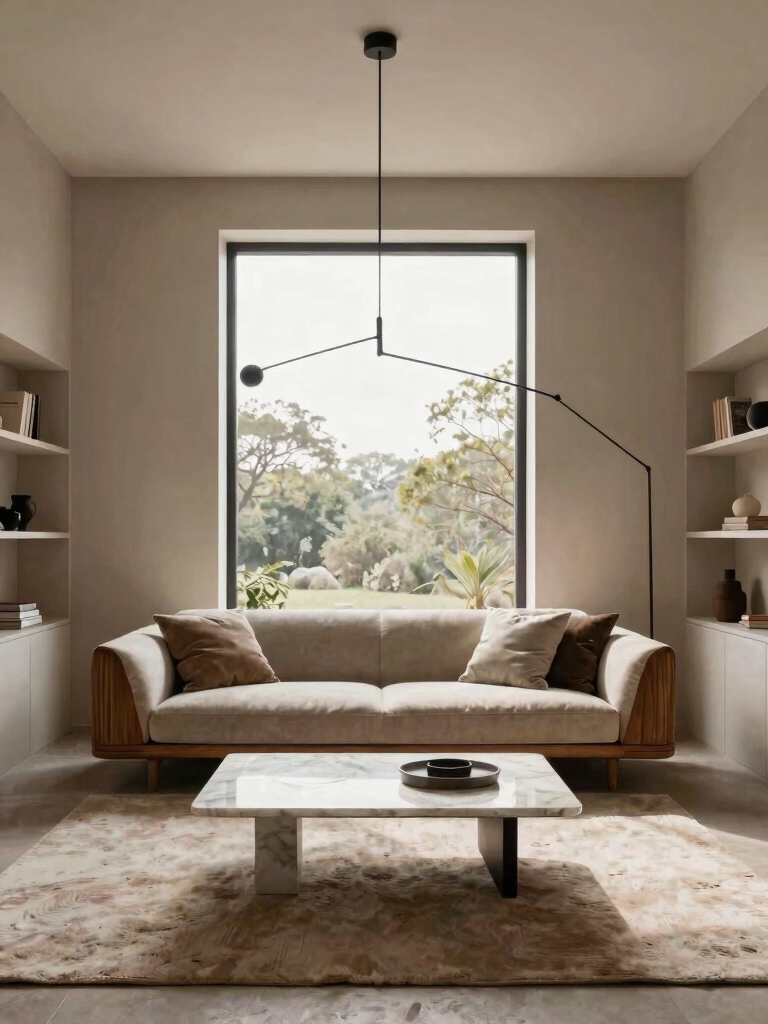
Adding plush textiles and ambient lighting can enhance the cosy living room ideas for chilly evenings, making the space even more inviting.
Brighten With Soft Whites
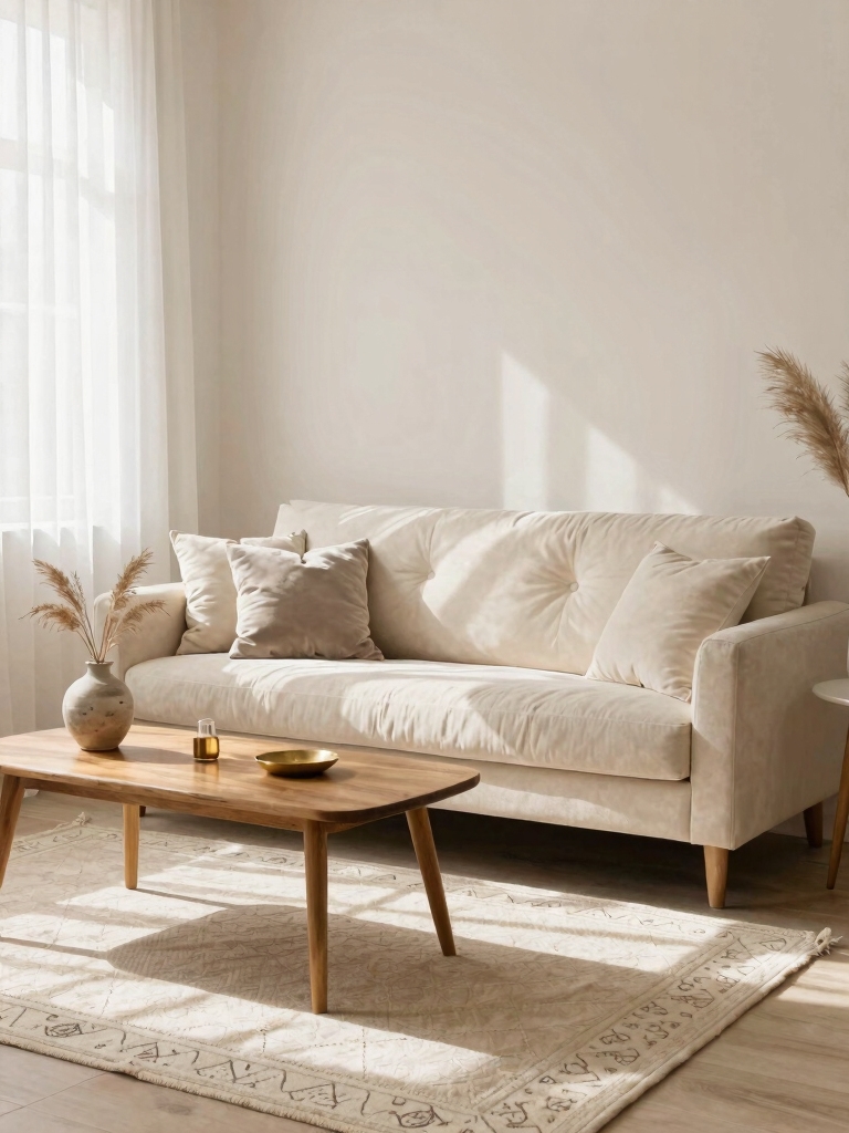
Soft whites are my go-to when I want a bright, cozy room without feeling sterile.
I mix soft warmth with clean surfaces, letting natural light do the lifting. Choose low-sheen finishes for softness, and pair with natural textures to add depth.
Keep furnishings simple, focused, and timeless, so the space feels calm, inviting, and effortlessly coordinated, year after year.
Cozy Glow Of Warm White
Soft warm whites catch the light in just the right way, giving rooms a glow that’s inviting without feeling fussy.
I embrace this shade for its cozy punch, pairing it with natural textures and soft textiles. It stays calm yet bright, creating practical, timeless spaces.
You’ll notice cleaner walls, easier maintenance, and a welcoming atmosphere that adapts to any season.
Classic Greys With Just-Right Undertones
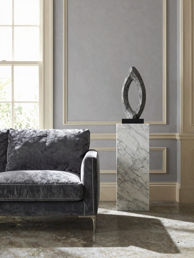
I think the right grey isn’t just about shade, but about the undertone that quietly supports your mood.
I’ll show you how undertones matter, how greys work with accents, and how to pick those tones that feel calm and timeless.
Let’s explore colors that coordinate with pops of texture and warmth, so your space stays cohesive and inviting.
Adding vibrant accents to your grey couch living room can bring life and personality to the space without overpowering the classic base.
Undertones That Matter
Undertones matter more than you might think when you’re selecting classic greys for a room. I tune undertones to mood and light, keeping it timeless and welcoming.
- Choose warm vs cool based on natural light
- Test swatches at multiple times of day
- Pair with whites to highlight subtle shifts
- Consider furniture wood for harmony
- Trust your instincts; refinement comes with wear
Greys For Mood
Greys with the right undertone set the mood fast, and the trick is choosing classic shades that feel calm yet alive in your space.
I’ve learned to pick mid-tones with subtle warmth or cool clarity, avoiding stark contrasts.
These hues offer comfort, polish, and lasting calm, letting natural light sketch the room’s rhythm without shouting for attention.
Practical, timeless mood.
Coordinating With Accents
- Pair cool greys with warm wood tones
- Introduce crisp white trim for contrast
- Choose matte metals to soften sharp edges
- Layer textures for depth
- Test undertones in daylight before committing
Navy as a Sophisticated Anchor Color
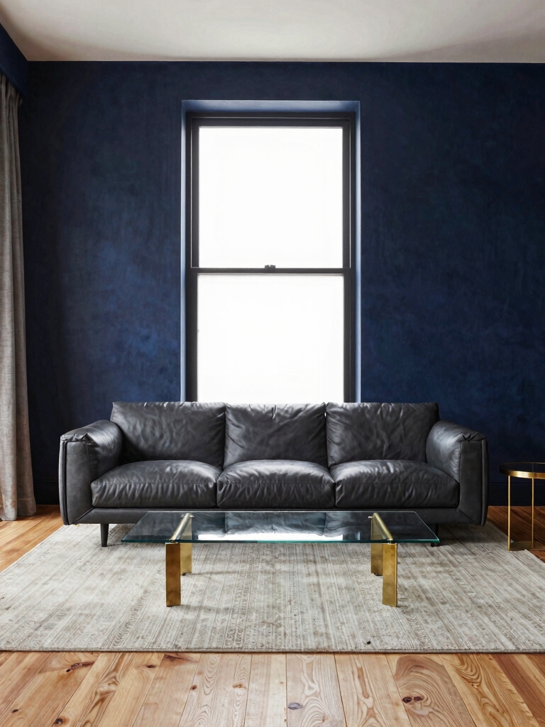
Navy serves as a sophisticated anchor color because its depth grounds a room while elevating brighter accents.
I love how it steadies busy spaces, letting art and textiles pop without shouting. Pair it with warm woods, soft neutrals, and textured fabrics for timeless contrast.
It’s versatile, forgiving, and easy to update as trends shift, maintaining calm sophistication. Transform your space with vibrant room color ideas that complement navy’s rich tone.
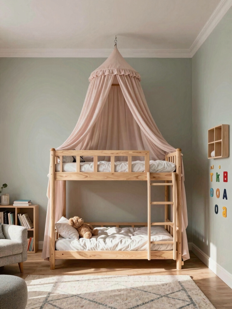
Sage Green for Calm, Nature-Inspired Rooms
I’m drawn to sage green as a calm, nature-inspired backdrop that keeps spaces feeling fresh yet timeless.
Think calm nature-hued palettes with soothing green accents that quietly support everyday life.
I’ll guide you toward serenity through plant life, textures, and simple, practical choices that stay stylish year after year.
Incorporating nature-inspired green rooms can transform your bedroom into a peaceful retreat that feels connected to the outdoors.
Calm Nature-Hued Palettes
Sage green brings a calm, nature-infused backbone to any room, helping you feel relaxed the moment you walk in.
I’ll share simple, enduring ideas you can trust.
- Pair with natural wood and soft textures for warmth
- Use varied greens to add depth without clutter
- Choose breathable fabrics for year-round comfort
- Balance with creamy neutrals to expand space
- Add greenery for life, not distraction
Soothing Green Accents
Green accents quietly ground a calm, nature-inspired room. I lean into sage tones to soften walls, furniture, and textiles without shouting.
You’ll notice how subtle greens pair with warm woods and neutral fabrics, creating balance that ages well.
I keep textures tactile and colors cohesive, so your space feels inviting, usable, and timeless—without chasing trends or clutter.
Serenity Through Plant Life
Plants do the heavy lifting, turning a room into a calm, rejuvenating natural retreat with sage-green hues quietly guiding the mood.
I’ll keep it simple: embrace plant life to soften edges, improve air, and invite quiet moments. Your space thrives with thoughtful placement, easy-care species, and textures that echo nature.
- Use varied greens for depth
- Choose low-maintenance plants
- Group for focal points
- Pair pots with natural materials
- Rotate plants seasonally
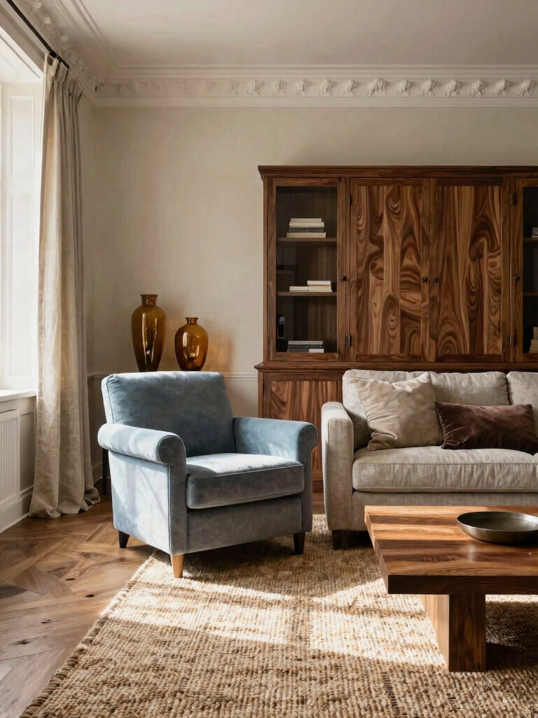
Rich Blues for Depth and Comfort
Rich blues bring depth to a room while wrapping you in a comforting, timeless feel; they pair beautifully with warm woods and natural textures, making spaces feel both grounded and inviting.
I’d use them as grounding walls, then layer lighter linens, metal accents, and soft lighting for balance.
Practical, versatile, and enduring, this palette grows with you over time.
To truly transform your space, consider incorporating aesthetic decor ideas that highlight these rich tones and create Instagram worthy spaces.
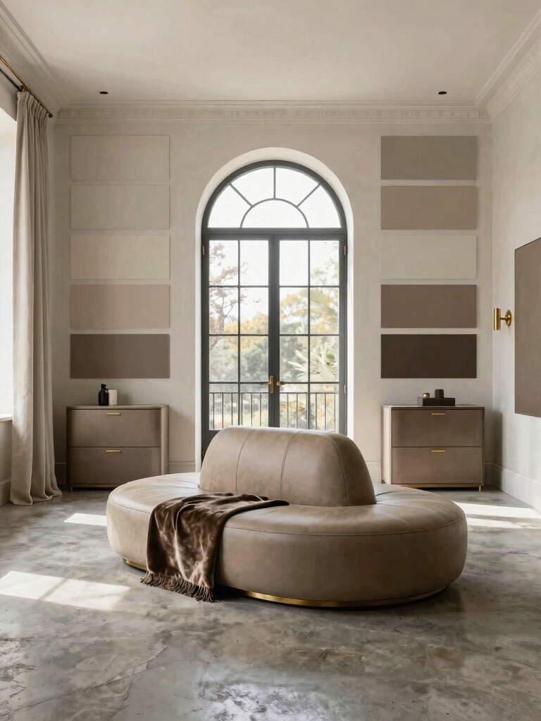
Taupe and Greige for Versatile Backdrops
I find taupe and greige make for versatile backdrops that never feel dated.
I’ll walk you through how their timeless appeal can anchor a room while leaving space for color and texture.
Let’s explore practical ways to use these neutrals for calm, lasting interiors.
These shades remain popular choices among living room paint color ideas trending now.
Versatile Backdrops With Taupe
Taupe and greige make versatile backdrops because they blend warmth with a clean, neutral edge.
I use them to anchor rooms, then layer color thoughtfully. They adapt to shifts in light, keeping spaces calm.
Here are practical ways to maximize impact:
- Pair with bold accents for contrast
- Highlight natural textures with wood or linen
- Use layered whites for depth
- Opt for muted art palettes
- Keep surfaces uncluttered for focus
Greige’s Timeless Appeal
Greige offers a timeless backbone for any room, balancing warmth with a clean, modern edge that stays calm under changing light.
I see it as a versatile backdrop that adapts with accents and textures, never shouting. It invites comfort without crowding, blending taupe and greige tones to create cohesive spaces.
Practical, enduring, and wonderfully adaptable—a true design constant.
Greyscale Palettes: Texture and Depth
Texture and depth in greyscale palettes come alive when you layer tones, from palest silver to deepest charcoal, so the room feels inviting rather than flat.
I’ll guide you with practical texture tips that stay timeless, avoiding fuss.
- Build contrast with light, mid, and dark shades
- Use matte surfaces to soften glare
- Introduce subtle patterns for depth
- Add tactile textiles in varying weights
- Balance metallic accents sparingly
Incorporating inspiring room makeover ideas can help you visualize how these elements come together beautifully.
Timeless Earth Tones: Terracotta, Sand, and Clay
Earth tones offer a warm bridge from the greyscale textures we covered, giving rooms a grounded, timeless feel.
I lean into terracotta, sand, and clay to create inviting warmth without overwhelming light. These hues pair with natural materials, echoing sunlit evenings and cozy corners.
Practical tips: balance with neutrals, test samples, and keep furniture silhouettes clean for lasting harmony.
For more inspiration, explore creative room ideas that transform any space on a budget.
Muted Pastels for Subtle Freshness
Muted pastels bring a gentle lift without shouting for attention.
I’ve found these hues refresh without dominating, pairing easily with wood tones and neutrals. They feel calm, inviting, and timeless, perfect for daily living.
Here are practical picks to try:
- Powder blue
- blush pink
- sage green
- lilac
- pale peach
Charcoal Accents Without Overpowering a Room
Charcoal accents can anchor a space without dominating it, especially when they’re about careful placement and proportion.
I use charcoal sparingly on textiles, trim, and a single statement piece to ground a room without stealing its light.
Pair it with warm neutrals, soft textures, and natural wood, ensuring balance, rhythm, and a timeless, welcoming feel.
Subtle, lasting impact.
Mix Neutrals and Accents Like a Pro
Mixing neutrals with accents isn’t about perfection; it’s about balance you can live with.
I guide you to pair calm bases with thoughtful pops, keeping rooms cohesive and welcoming. Start small, test swatches, and adjust warmth as needed.
You’ll create depth without clutter, and timeless appeal will follow.
- Start with a dominant neutral
- Introduce one accent color
- Vary texture for interest
- Use metallics sparingly
- Consider scale and rhythm
Lighting and Materials to Preserve Color Longevity
Good lighting and the right materials keep color true for years.
I’m guiding you to choose bulbs with steady color and fabrics that resist fading. Use UV-protective window treatments, low-glare finishes, and durable paints.
I’ll share practical tweaks: monitor light exposure, avoid harsh contrast, and maintain surfaces regularly.
Together, we preserve depth, warmth, and the timeless feel you love in every room.
Room-by-Room Color Guide: Bedrooms, Living Rooms, and Offices
Color choices matter room by room, and I’ll guide you through practical palettes that fit bedrooms, living rooms, and offices with timeless warmth.
- Bedrooms: soft neutrals with gentle accents for calm repose
- Living rooms: layered tones to invite conversation and comfort
- Offices: focused, neutral bases with one uplifting hue
- Pairing tips: balance light and dark for depth
- Timeless classics: white, beige, charcoal, navy, sage
Test, Refine, and Lock in Your Timeless Color Plan
I’ll fine-tune with subtle tweaks, trust practical results, and commit to a cohesive scheme you’ll enjoy long-term, with confidence and calm.
Conclusion
I’m telling you, choosing timeless color is like discovering the secret door to a perpetual glow-up. Every shade in this guide becomes a trusty sidekick—soft whites that whisper, neutrals that steady the heart, navy that quietly commands respect. You’ll layer personalities, not just paints, and your rooms will age with grace, never shouting for attention. Trust the tests, refine with intention, and lock in a plan that feels forever you—cozy, polished, endlessly practical. You’ve got this.